Real Commodity Prices in the Long-Run
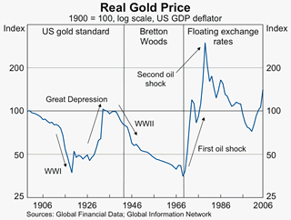
The RBA Bulletin puts the recent boom in commodity prices in long-run perspective. The article includes the following chart of the real gold price. The chart shows that gold makes a poor long-run investment. The best that could be said for gold is that it has held its value over the long-run, but with some very pronounced cycles along the way. The long-run returns to gold are paltry compared to the real returns from equity indices like the S&P 500 over the last century.

posted on 19 April 2007 by skirchner
in Economics, Financial Markets
(1) Comments | Permalink | Main
|

Comments
In contrast the Real Oil Price chart (Graph 7) looks pretty good:
http://www.rba.gov.au/PublicationsAndResearch/Bulletin/bu_apr07/Graphs/rec_rise_com_prices_long_run_pers_graph7.gif
I keep reading predictions that its heading down to $50 or $40 but it remains stubbornly high.
Posted by .(JavaScript must be enabled to view this email address) on 04/28 at 09:38 PM